Carabello Coffee Introduces New Packaging
In the past 7 years, we have hand-stamped tens of thousands of plain brown Kraft coffee bags. And while there were many aspects of that simple packaging that we loved, we also knew it came with some trade-offs. So, this past year we made the decision to make a significant investment in better packaging our coffees.
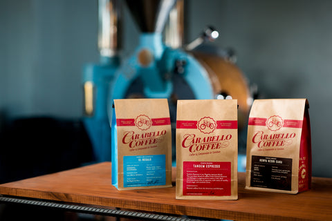
For the design we chose to work with Austin Dunbar of Durham Brand Co in Covington, KY. For the packaging itself, we chose Savor Brands because of their new flat bottom side gusseted bag technology.
From Day #1 we have built our customer base on buying freshly roasted coffee and encouraging them to drink it within 7-10 days, so, the non heat-sealed, Kraft bags worked well. They had the handmade feel we wanted, and they had an old-school, personal feel to them as well. Each was a little unique, as the stamping was never the same twice, which helped us reinforce that what we did, we did by hand. That helped us connect the human element to our customer's coffee experience. But those bags clearly had their limitations.
For one, they did not tell our story: who we are, how and why we started this philanthropic coffee roasting company, etc. In the beginning, literally every customer who purchased a bag of our coffee purchased it from either my wife or I. That meant we got to connect with each of those people and tell our story. Folks could ask tons of questions and get all the info about a particular coffee from us. During that time, there really was no need for labels that included a lot of detailed information or our story printed on the back of the bag.
 But as we have grown, and our coffee is increasingly mailed to different parts of the country and purchased in more and more places, the packaging now has to communicate in ways it never had to before. The idea that, people we had never met were increasingly ordering our coffee, folks who had no personal interaction with any of our staff, motivated us to start the process of this change. The primary driver in all of this was: we believed we could help people make a stronger emotional connection to the brand with better packaging. And so we teamed up with Austin at Durham Brand Co., a local design firm who knows us personally, regularly interacts with our company culture and ethos, and who also knows our city and region, to help us build this all out.
The process Austin took us through was phenomenal. He did a fantastic job helping us work through how we would keep both the visual and tactile essence of the brand intact by continuing to the use of the Kraft paper bag. While at the same time helping us to maximize that bag to thoroughly communicate who we are and the quality of what is inside.
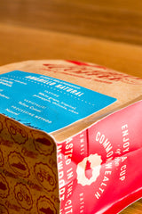
We kept the handmade feel by continuing to have each bag signed by the person who bags it. The labels are thick and have a nice texture and feel to them, like what you'd expect from a letter pressed label. The bags still have that Kraft feel, but now with a seal-able foil lining that helps us keep the coffee fresher longer.

Along the way we also decided to introduce a secondary color to the brand in the blue on the side of the bag, as well as to connect more to "place" and the fact that we are a product of the great commonwealth of Kentucky. Geography and our roots are important to us, and these new bags help us strengthen that connection.
Finally, Paul at Savor Brands (bags) and Erin at Steinhauser, Inc. (labels) really helped us pull it all together. In every way, these companies came to the table with the skill and wherewithal to help us significantly upgrade the bags, which ultimately holds the thing that is connecting us with our customers: the coffee. Today our coffee is housed in bags that really reflect the quality of what is inside. We work hard to source coffees that are both very high on the specialty side of the coffee spectrum while at the same time very approachable to people's palates, and what we have pulled off on the packaging really complements that.